Hiintern's admin system is an internal operation platform that plays a crucial role in maintaining online job postings and ensuring platform security. Hovever the existing system was in a state of semiparalysis, and the original follow-up development plan was left unfinished due to logical conflicts. The company leader asked me to redesign the system for an easier experience.
My Role
Led end-to-end design, conducted user researches and design reviews, managed requirements. Worked directly with the company leader and other developers.
Key Results
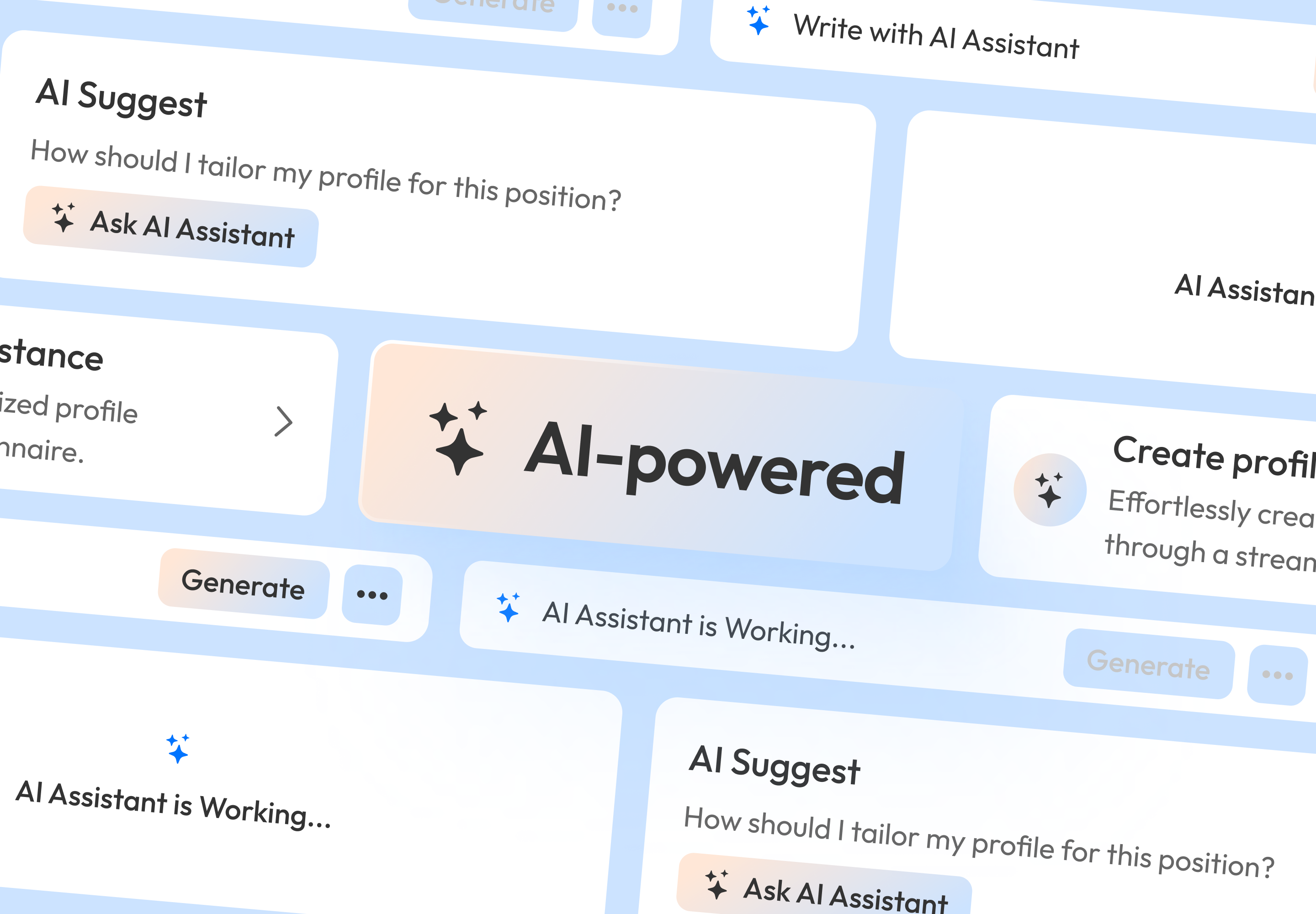
Delivered 150+ screens and the whole system was implemented successfully in 7 weeks.
35.17%
Average Task Time
Easy to Use
User Feedbacks
Code Decouping
Assisted The Dev Team
What led to the system semiparalysis and development block?
To understand the problems, I conducted user interviews and usability audits.
Method 1: User Interviews
Since this is an internal system, I talked to colleagues who had experience in relational operations.
They Said...
“Buttons always change, which really confused me (block, approve, reject).”
“After completing an operation on the detail page, returning to the list immediately feels quite strange.”
“Currently, it’s post-review, and after a job is posted, it should directly be in the Open status (currently, the status is Pending). Additionally, at this point, the ‘Approve’ button’s actual function should be ‘Review.'”
They Said...
“There are two menus for company management.”
“Job statuses need to be organized.”
“Block->Block2->Block3->…, ->Unblock, generates one record. Can this process be simplified to generate only one record for each operation?”
They Said...
“It’s too complex. I think tabs (processed, unprocessed) and charts can be removed. Another drawback is that the processing button should be closer to the list of reported items.”
“The words in the history section look awkward and are arranged unevenly.”
“There are too many columns for reported objects, making it unclear. Would consolidating them into a single column be better?”
Method 2: Usability Audits
Based on feedback from colleagues, I analyzed the existing system to identify specific usability issues in terms of user experience.
Duplicate Company Management Sections
The list of companies with an “Approved” status in the “Company Applications” is the same as the list of “Companies” in “Management”.
Inconsistent Position Status Actions
Actions for internships with different statuses are inconsistent. Normal internships have the same actions as those that require review.
Lack of Admin Task Prioritization
Upon login, administrators can’t quickly identify urgent tasks. They must navigate various modules to individually check for tasks, causing inefficiency in task handling.
Functional Overcoupling
In the Reports section, administrator actions impact stable data, including accounts and existing internships. This section comprises lists of reported company accounts and reported internships, some of which partially overlap with the lists under the Management section.
Note: As the Reports section hasn't been developed, there are no images available for presentation.
As a Hiintern admin, my responsibilities include:
Reviewing company applications
Managing existing accounts and internships
Viewing site analytics
Addressing user reports
Managing content shown on Hiintern websites
Prototyping & Reviews
Based on information gathered from user interviews and usability audits, I sketched various structural concepts and key screens to explore possible solutions. You can experience the original concept through the Notion page below. However, this prototype still has the issue of repeated lists. 😅
To iterate on the design, I conducted 4 review sessions with stakeholders. Finally, we arrived at a more intuitive solution, emphasizing the importance of user engagement and better adaptation to real-world workflows.
Final Solutions
Elevate Content Types Hierarchy
Raise the hierarchy for core content types—company accounts, internships, employer accounts, user accounts—enabling easier access to these essential functions.
Before-Folded
After-Folded
Before-Expanded
After-Expanded
Clarify Content Status and Operations
Define clear states for company accounts, internships, employer accounts, and user accounts. Align these states with appropriate actions to reduce confusion.
Company Accounts
Status
Actions
Active
Block
Blocked
Unblock
Awaiting
Approve, Reject
Internships Accounts
Status
Actions
Hiring
Block
Ended
Block
Blocked
Unblock
Awaiting
Approve, Reject
Employer Accounts
Status
Actions
Normal
Block
Blocked
Unblock
User Accounts
Status
Actions
Normal
Block
Blocked
Unblock
Centralized Dashboard for Data and Tasks
Create a centralized dashboard that aggregates data and pending tasks, providing an overview for operations staff to manage their workload more efficiently.
Decouple Code from Requirements Side - Remove Repeated Lists
Simplify the structure by placing company applications (‘Entry Requests’) and ‘Admitted Companies’ under the ‘Company’ module. Convert ‘Approved’ company applications into operation records, no longer using duplicate tables.
Note: The data in this video were fabricated.
Decouple Code from Requirements Side - Limit Reports to Reporting Only
Separate the process of addressing reports from managing accounts and reviewing internships.
Note: The data in this video were fabricated.
Takeaways
Focus on real scenarios, not just functional logic
If you focus solely on functional logic, upcoming tasks may lead to logic decoupling.
Never separate design from development in tech
Some code overcoupling may result from the requirements side originally, so never only think within the design scope.
Don't be limited by what's already there
It's really hard to break free from the former logic once you've delved deep into it.